LEAF National

Leaf National - Anthology and Reproductive Justice Report
Project type: Print and Digital Report
Role: Designer
Year: 2022
Tools used: Adobe Illustrator, InDesign and Canva
This anthology publication is part of the Women's Legal Education and Action Fund's (LEAF) Reproductive Justice Project. This project looks to advance reproductive justice in Canada through law reform advocacy at the provincial and territorial levels. The contributions in this anthology include "snapshots" which are unique perspectives from participants throughout Canada about barriers, challenges and inequalities. There is a mix of written and spoken verses, artwork, poems and reflections (individual and with the community).
Read the digital Anthology here.
Read more about the Reproductive Justice Project here.
Acknowledgements:
Publication: Women's Legal Education and Action Fund (LEAF)
Project Design and Supervision: Kat Owens
Lead Anthology Design: Winnie Zhang
Design Supervision: Jen Gammad
Project Support: brea hutchinson and Grace Hitimana
Illustrations: Paige Jung
The Reproductive Justice Project is supported by Women and Gender Equality Canada
Print Specifications:
✦ 8.5" x 11" Letter perfect bind booklet
✦ Cover: 11lb silk cover with soft touch laminate
✦ 70lb text

Design Process
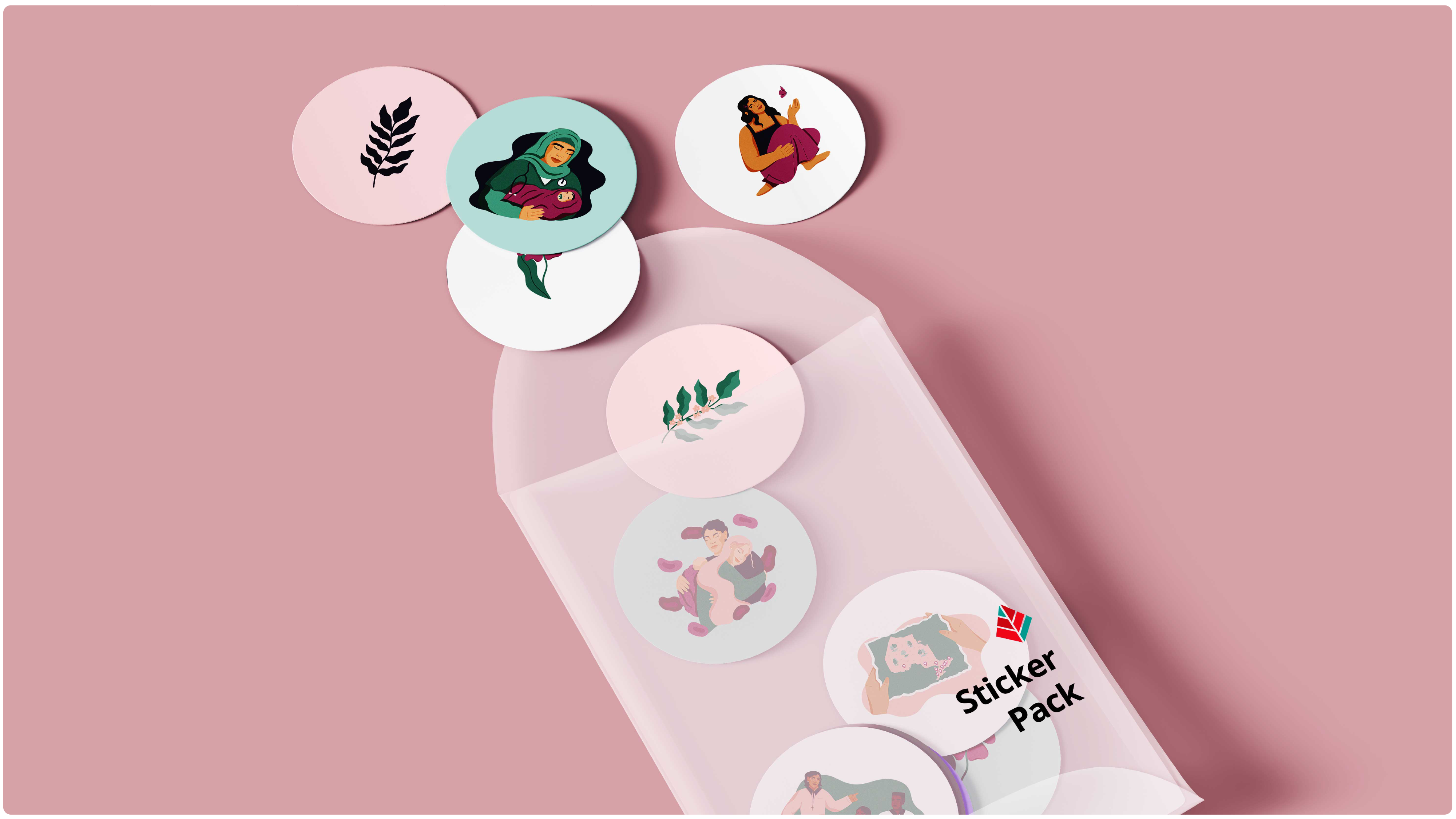
Reviewing the organization's brand identity, it gave me a better understanding before developing a cohesive style guide for this project. We reached out to a Vancouver based illustrator, Paige Jung, who created graphic illustrations for me to use throughout the two projects.
Style Guide
✦ Develop a colour palette
✦ Curate typography
✦ Source Canadian BIPOC illustrators and artists
Research
✦ Find examples of similar projects
✦ Design layouts for print
✦ Examples of online anthologies
✦ Specs for print design
Layout Process
✦ Basic layout of a two column format
✦ A list of pull quotes from each piece of reflection and interview
✦ A list of potential illustrations and graphic elements needed for this and the Reproductive Justice Report
Separated the content by type (reflections, art, poems & interviews) then decided which of the written pieces needed illustrations and how many to accompany each one. I proceeded to begin the overall order where I made sure to alternate any poems or artwork in between written pieces. By grouping into similar themes such as barriers of access healthcare as a trans person, importance of the role of midwives etc. Once all the pages and content have been set up, I played around with negative space and different headings. As we were waiting for the illustrations, there were wireframes as placeholders. After printing out a few sample pages, we noticed the legibility on paper which resulted to decreasing font size and increasing the line heights between paragraphs. Inserting the final illustrations really pulled everything together and allowed us to get a sense of the final product!


.png)
